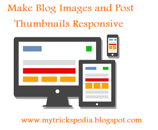
So in this Tutorial you will learn How to Make Blog images and Thumbnails Responsive to adjusting their Sizes and dimensions without effecting their Resolutions in Mobiles phones and Tablets.Images that we upload in large Sizes doesn't take fit in mobiles version devices and this thing affects a bad impression for our Blog Users and creates a negative effect.
Today i will tell you how can you make your Images and Thumbnails adjustable that their width and height changes as they were open from small or big screens like If your image is For The Web Version and in Big Size and High Resolution , So when you open it through small screens like Mobiles phones and Tablets , it will automatically adjust its width and height with respects to Small Screens and displays as their quality and looks suitable.
Why should we need Mobile Friendly Images?
The most amount of traffic that your blog get from such devices which are smaller , more slower and low bandwidth devices.On these such type of small screen devices your desktop images take more time for loading and this thing creates a bad effect on users.So by making your Blogger images Responsive your High resolution images will Load Fast and also SEO ranking Will increase of your blog.
Different Image Size For Different Pages:
We use Images in different Places and for different Pages.For Example we use images in header, footer, sidebar. The Most number of images that we use are in Post Content.All the Time a blogger wish to display his Thumbnails Images in Small size on homepage posts and would like to display those images in Larger Size in Post Content whenever his post page is viewed by someone.Therefore Different Images size for Different Pages.As the Images that were in Header and in Post Content are more wider than those images that were used in Blog Footer and in Sidebar . So we have to Style Each image type Accordingly .
Find Parent ID's or Classes:
So we need to find what is The Parent ID or Parent Class of any HTML Elements in our Blogger.Here are the Parent ID's or Parent Classes in our case:
1:The Parent Class or Parent ID for Header widgets is .headerright and .headerleft
2:The Parent Class or Parent ID for Sidebar column is .#sidebar .widget-content
3:The Parent Class or Parent ID for Footer ID is #lowerbar-wrapper.
4:The Parent Class or Parent ID for Post is .post
As we are going to customize the images in our Blogger , therefore as we know that for every image in blogger we have <img> HTML TAG ,so we will use img class for all the Above Parent Classes and Parent ID's .
Select Device Breakpoints
Now Here In this part We have to Add this CSS Codes in our Blogger Template HTML for the device Breakpoints With Adding this CSS Responsive Cheat Sheet.We will Choose a breakpoint of 786px which is MyZone.Here is our Following CSS code that we are going to add in our Blogger template.
/*-----Mobiles, Tablets MyZone ----------*/
@media only screen and (max-width:768px) {
.headerright a img,.headerleft a img{
max-width: 75%!important;
margin-left: 0;
position: absolute; height:auto;
left: 30px;}
.post a img, .post img{max-width:95%; height:auto;}
#sidebar .widget-content a img , #sidebar .widget-content img { max-width:98%; height:auto;}
#lowerbar-wrapper a img , #lowerbar-wrapper img { max-width:98%; height:auto;}
}
What is the Importance of max-width?
A mad-width Property which is set on 98% will proves that your Image is not exceeded 98% of the parent width container.If you will keep your mad-width property 100% than your images may overlap in parent container , so always keep 98%.Display images on Homepage and Posts with different size:
In this part we will customize our blogger images on homepage and Posts.If you want to display thumbnails on the Homepage and the large images with High resolution in Posts pages or if you want to floating the images in the left side in Homepage but also want to show them in the Center of the Posts pages then for this purpose you have to use some conditional tags and enclose the media queries inside the TAGS as it is shown below.You have to Add this code below of this HTML Tag in blogger template.
TAG: ]]></b:skin>
HOMEPAGE IMAGES or Thumbnails Code:
This Will Show images on the Homepage with the 95% width and Center with them small screen Phones which have less width than 480px.
<b:if cond='data:blog.pageType == "index"'>
<style>
/*-----iPhone 2G, 3G, 4, 4S Landscape View MyZone2 ----------*/ @media only screen and (max-width:480px) {
.post a img, .post img {width:95%; float:none; height:auto; clear:both; margin-bottom:10px;}
}
/*-----Mobiles, Tablets MyZone4 ----------*/
@media only screen and (max-width:786px) {
.post a img, .post img {max-width:50%; height:auto; float:left; margin: 0px 10px 10px 0px;}
}
</style>
</b:if>
POST IMAGES Code:
For the images which were used inside the blog posts pages use this following Breakpoint Code .
This Code will display images in the center of the Blog Posts pages with the width of 95%.
/*-----Mobiles, Tablets MyZone2 ----------*/
@media only screen and (max-width:768px) {
.post a img, .post img{max-width:95%; height:auto;}
}
You can also use these conditional tags for customizing your blog for making friendly with the mobile Devices.


0 comments:
Post a Comment